THE 'MIDLINE' BRAND
Loved by some but hated by many the 'Midline' logo and livery came and went rather rapidly.
In July 1986 the Provincial Manager for British Rail issued a design brief to four advertising agencies to develop an identity for the West Midlands rail network. This new image was deemed necessary to combat anticipated increased competition due to the deregulation of buses. The basic requirement of this brief was to portray the rail routes as a complete network.
The name 'MIDLINE' was proposed and accepted, and a logo produced which included both the WM logo, BR logo, and also both house colours. This was applied on literature, timetables, advertising and a series of experimental station liveries.
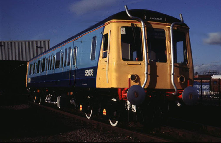
This is class 122 dmu No.55033 at Tyseley depot after repainting in an experimental 'Midline' livery in November 1986.
The resultant station designs were deemed as being unsuitable and the D+ADE at BR was asked to develop new proposals. After internal discussions between both parties totally new signage was agreed in Spring 1988. This included a blue branding stripe with a red lozenge. This design appeared on several trains, and to signs on new stations. New infrastructure, (namely Moor St. Station), was built with a strong blue theme.
The original logo existed through all these periods, despite the fact research showed it to be poorly understood and perceived. In December 1989 BR took the opportunity whilst Centro was developing its identity to launch a new 'Midline' logo. This logo was significantly different to the previous as it did not carry any house designs. The new logo was quickly adopted by BR and added to joint publicity in a very aggressive way. This design was not accompanied by any business or communication strategy, but simply as a series of designs.
In September 1990 after Centro had persistently refused to accept the new 'Midline' logo, a compromise agreement was reached. This new logo style was very similar to the original in that it consisted of the BR and Centro logos at different ends with the 'Midline' name in the centre. This suffered from the same problems of the original logo, namely a lack of understanding of roles between parties, and a poor awareness of the word 'Midline'.
Research consistently showed a low awareness of the 'Midline' brand despite its life of over 4 years. There had not been a clear strategy between both Centro and BR as to what the brand was expected to achieve. It had lacked consistency in approach, and its application had not been coherent with Centro's overall strategy.
Centro's portrayal on stations increased after January 1990 with the application of new totems, goal post signs, platform plaques, and a dedicated train livery.
In 1990, the concept of the 'Midline' brand lay in a state of confusion, due mainly to a lack of strategic direction by BR and a degree of apathy on behalf of Centro.
Little had been added since October 1986, and no clear strategy existed in terms of the overall product, BR's role, Centro's role and brand development.
The concept of seeing 'Midline' as a network of routes was not borne out by journey patterns. The system was not used by most as a network, but by the majority for radial journeys into and out of Birmingham City centre.
There was no real evidence to suggest that having made people aware of the journey opportunities that existed within the network they had responded by travelling to these destinations, except in expected seasonal patterns.
The majority of travellers saw only their line of travel, and had no need to extend beyond it. Trying to get people to travel beyond their normal routes was not helped by the lack of attractive leisure destinations in the West Midlands.
The 'Midline' strategy worked well for BR who got a high profile for their brand whilst Centro suffered from a lack of understanding caused by an underselling of its name.
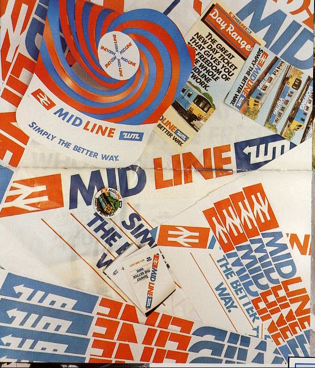
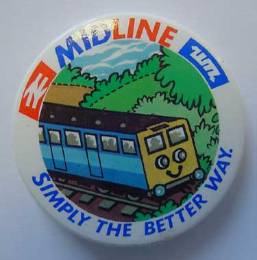
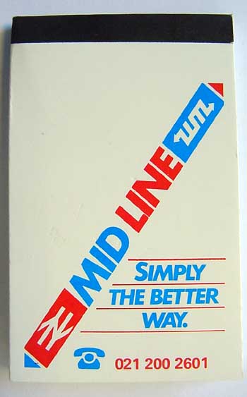
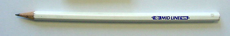
Hats, badges, note books all heralded the launch of 'Midline' in 1986.
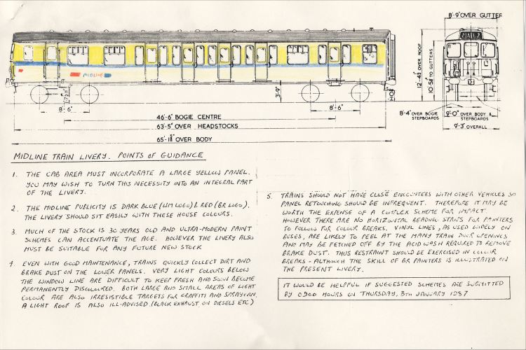
A 'mock-up' of the new 'Midline' livery on a class 310 emu.
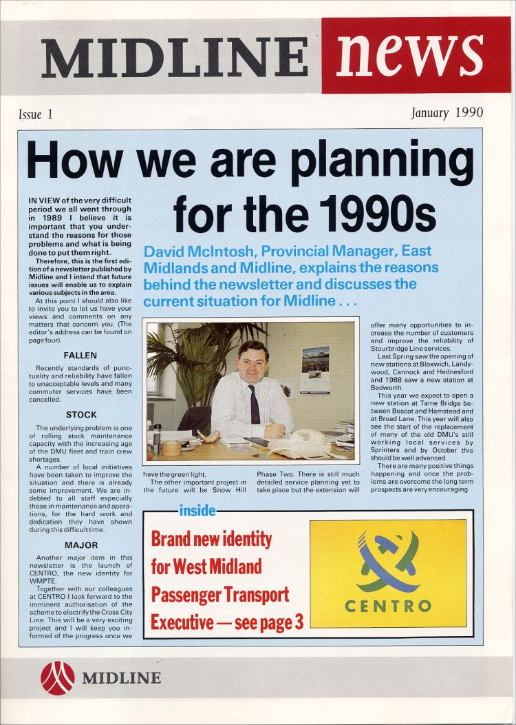
Fast forward to 1990 and 'Midline' has a new logo and so does the W.M.P.T.E.
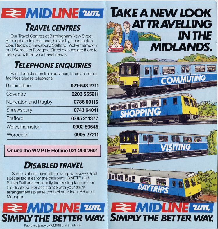
Yet more new phone numbers to remember in 1987.
'We're the Professionals' - it must be true as it says so in this 1987 leaflet.
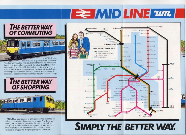
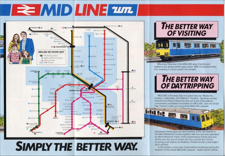
A nice map - the rest is below.